Preface
I am not a scientist. I want to just say that right now, in the beginning. But I'm a body, and so are you.
Merleau-Ponty's philosophy, which argues that you don't have a body, but rather, are a body, sets the stage.1 Perception isn't something that happens inside your head while your body carries you around. You interpret everything you know through your body. The idea is that all knowledge is somatic first.
Science takes what's inside your body and turns it into data and objects we can study on the outside from a distance. But what gets lost in this process is the felt sense of ownership over the data and the body it came from. I'm interested in how we can feel more connected to data. This project takes third-person scientific data and returns it to the first person. Back into the body it came from.
Right now, we're living through an accelerating attack on science, so I'm approaching this project with a particular urgency. Public research is being defunded and no published data is safe from erasure.2 Knowledge should belong to everyone. This political threat is layered on top of another problem: science has a literacy gap. For those of us who haven't learned much about science, we cannot understand much of this knowledge. But this gap is about access, not intelligence. And access is a design problem.
My background in Art History and Comparative Literature forms my archive-based practice. I'm interested in how traces of our physical bodies enter design and typography. I'm especially interested in the fact that politics are inherently somatic. Lawmakers' decisions can directly impact our ability to breathe. I'm interested in whose bodies design accommodates, and whose it doesn't.
In 2017, a team of researchers at Harvard, led by geneticist George Church, encoded a series of images into the DNA of a living organism. The images of Muybridge's horse were stored in the molecular structure of bacteria. When sequenced, the DNA rendered the images back. The horse was in the cell. I couldn't stop thinking about that.3
If biological material can hold visual information — if the body is already a kind of archive — I wondered what I could make myself. Church's experiment moved in one direction: taking something human-made and putting it into biology. I wanted to go the other way — to look at what biology had already made, and find something human in it.
It felt the most honest to use the physical body as material somehow. I'm interested in how we can hide information inside it. So, naturally, I decided that I wanted to make a typeface out of DNA. Thankfully, someone close to me is a scientist, and he was able to help me brainstorm purely visual ways I, as a designer, could make something like this happen. And along came AlphaFold.
Splice is a design response to both political urgency and the science literacy gap. Every protein in this project is in your body, and Splice makes it visible. It's just about perspective.
Introduction
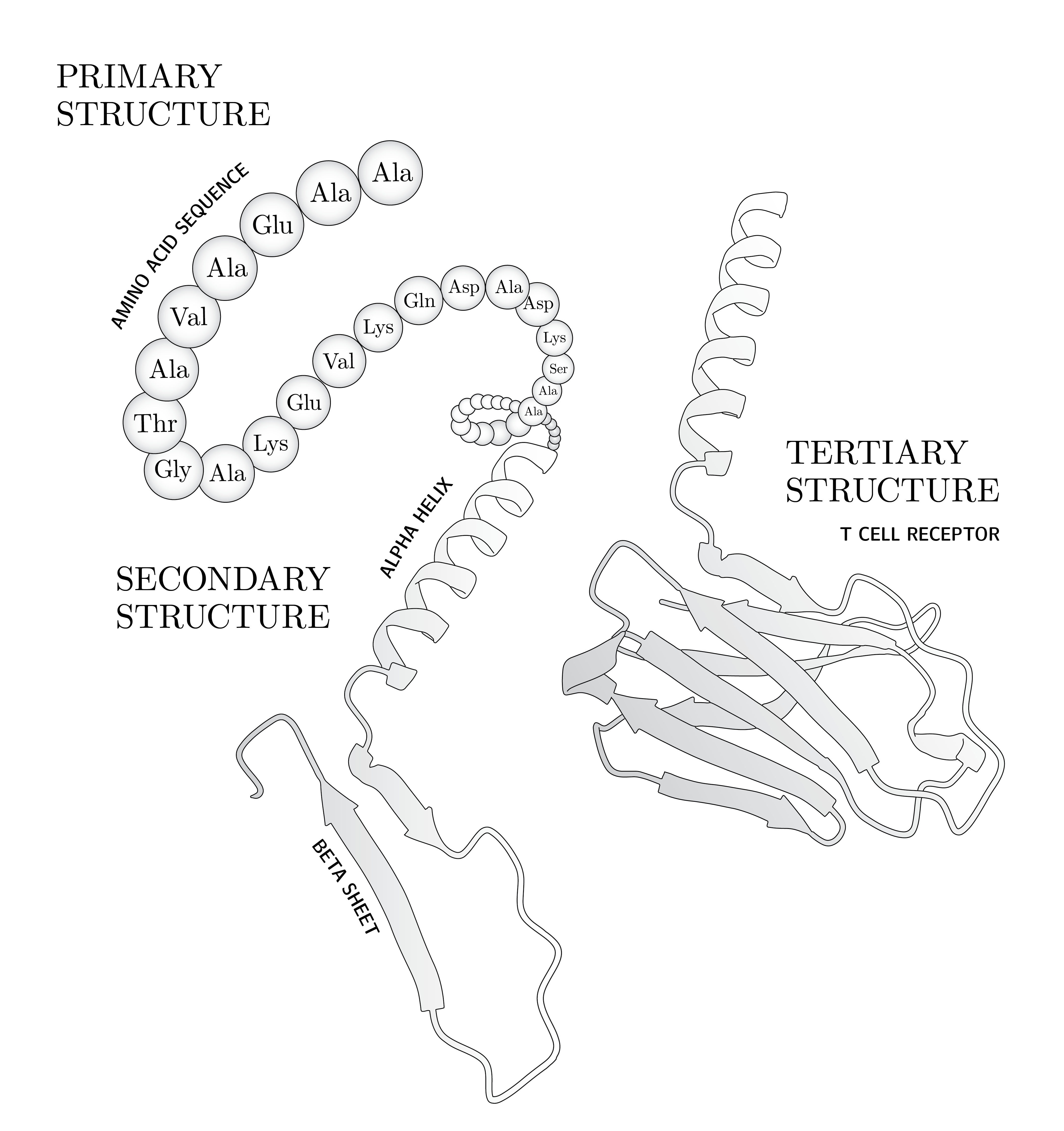
Inside your body, billions of little machines are hard at work. They perform important roles all throughout your body, like serving as structural supports, hormones, and enzymes. These amazing machines are proteins, which are made from the same twenty amino acids arranged in different linear sequences. When these amino acids come together to form a protein, they connect via peptide bonds. As each bond forms, the protein begins to fold in on itself, creating a three-dimensional structure. To a non-scientist like myself, these 3D forms are visually striking and beautiful. However, the way a protein looks is actually very important: its shape determines what it does and how it does it.
For decades, scientists could only visualize the 3D structures of proteins through time-consuming experiments. But in 2024, the Nobel Prize in Chemistry was awarded to David Baker, Demis Hassabis, and John Jumper for their work developing a system called AlphaFold.1 AlphaFold uses an artificial intelligence model to predict protein structure with near-perfect accuracy.2 To put it into perspective: after 60 years of global research, scientists only archived 180,000 protein structures. But in a single year, AlphaFold modeled over 200 million proteins. And they're available to anyone with a browser.
As a designer working in a moment when generative AI is flattening visual culture, I was looking for a raw design source — something that connects us back to our physical bodies and the marks we leave on the world. Scientific data about the human body felt right: it's honest and it belongs to everyone who has a body. AlphaFold presented a perfect digital library of visual forms for me to get lost in. As I was inspecting the model for Syncoilin (Q9H7C4), it struck me that it looked like the letter U if you rotated it just-so. This led to a spiral through AlphaFold's database, collecting human proteins that resembled letters of the alphabet when aligned in a particular way.
Each glyph in Splice originates from a predicted human protein structure from AlphaFold's Protein Structure Database (AlphaFold DB).3 Nothing was drawn by hand — all letters emerged from existing biological forms. The process: skim through the database of human proteins, rotate each model within the 3D viewer until it resembles a letter of the Latin alphabet, record the model's data and download the 3D model, then convert to vector to create a typeface. The methodology revolves around observation and pattern recognition in existing forms.
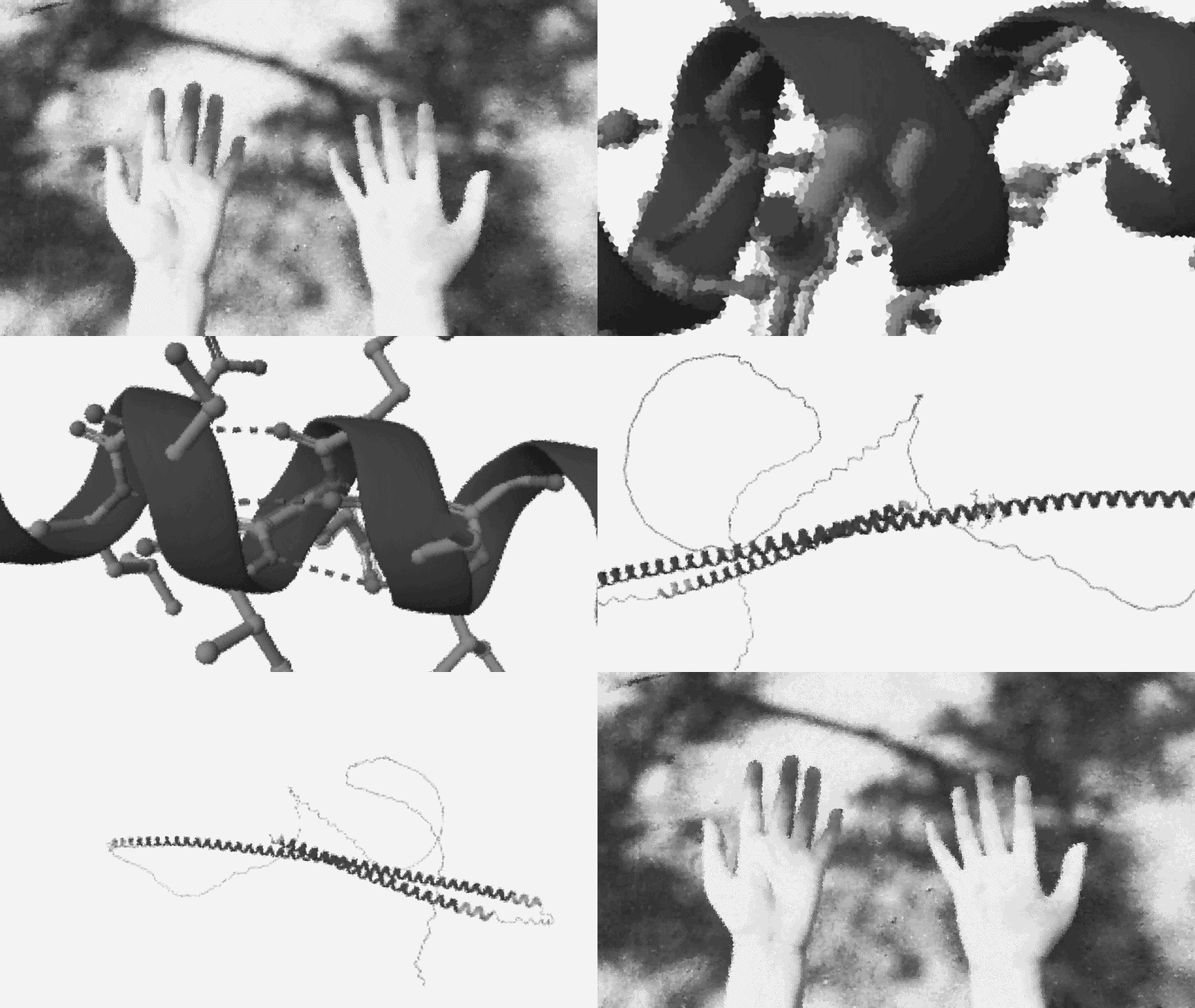
Splice sits at the intersection of science and design, so its namesake reflects that. In the body, to splice is a step in transcribing RNA into proteins. In science, to splice is to edit DNA or sequences. In design, to splice is to combine forms into something new. In each context, splicing is a method of working with parts to produce new outcomes.
I'll end with the story of AlphaFold's breakthrough. Predicting protein structures failed when sequences were fed in order. The eureka came when researchers scrambled the input, letting the algorithm detect patterns that linear thinking missed.4 Discovery, whether scientific or visual, often comes from imagining differently.
Splice uses this methodology. Each letter in this typeface only becomes legible from a particular point of view. The alphabet was always inside you. These are just the coordinates.
On Pareidolia
Pareidolia is the human tendency to perceive meaningful forms in random or ambiguous visual data.1 Like finding shapes in the clouds. Or the man in the moon.
It is usually described as a cognitive quirk — a misfiring of the pattern recognition systems that help us navigate the world. The brain, trained to find faces and forms, keeps finding them whether or not they're there. Splice treats it as a formal design methodology.
I opened the AlphaFold Protein Structure Database and began to rotate models. One at a time, in three dimensions, searching for letterforms hidden in molecular geometry. I set one rule: nothing would be altered. The protein structures in this project are scientifically accurate models. I could rotate and scale them, but I could not change the structure itself.
Some letters took minutes. Some took hours. Some required searching dozens of proteins before the right structure appeared. The letter A in this typeface is Titin, the largest protein in your body, rotated in a way that made its coiled, helical geometry resolve into two legs and a crossbar. Already existing, just aligned.
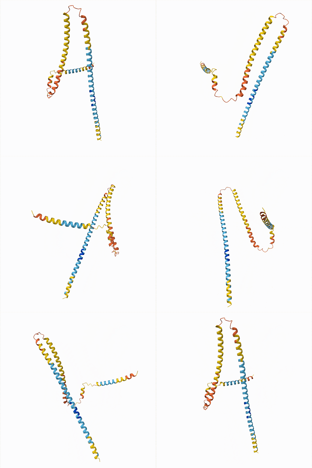
This is what makes pareidolia productive as a methodology rather than just trivial. The designer must pay attention and make judgments. While sorting through the data, you have to look at it from every angle, in every orientation, until you understand its geometry well enough to know whether the form you're searching for is present. The looking is the work.
The rotation coordinates for each letter mark the precise orientation at which a protein became a letter — the moment the point of view changed and the form appeared. Every set of coordinates represents hours of looking compressed into three numbers. Not designed. Discovered.
Pareidolia as a methodology requires no translation. The designer isn't translating data for an audience, but rather just looking at it directly, on its own terms. That act of looking is itself the bridge. It positions the designer not as an explainer standing between the public and the science, but as a fellow observer. The data describes us. The gateway to science is not always explanation. Sometimes it is simply attention.
The Installation
Splice exists as a gallery installation that originally opened on April 10, 2026 at Guest House LA. The centerpiece is a mechanical keyboard on a plinth. A screensaver cycles four phrases in the protein typeface:
Pressing any key dissolves the screensaver. Then, a visitor can type anything. Each character renders as a rotating 3D protein molecule, scaled to fill the screen. Their phrase is simultaneously sonified: amino acid sequences are mapped to musical tones, generating a unique ambient chord for every word typed.
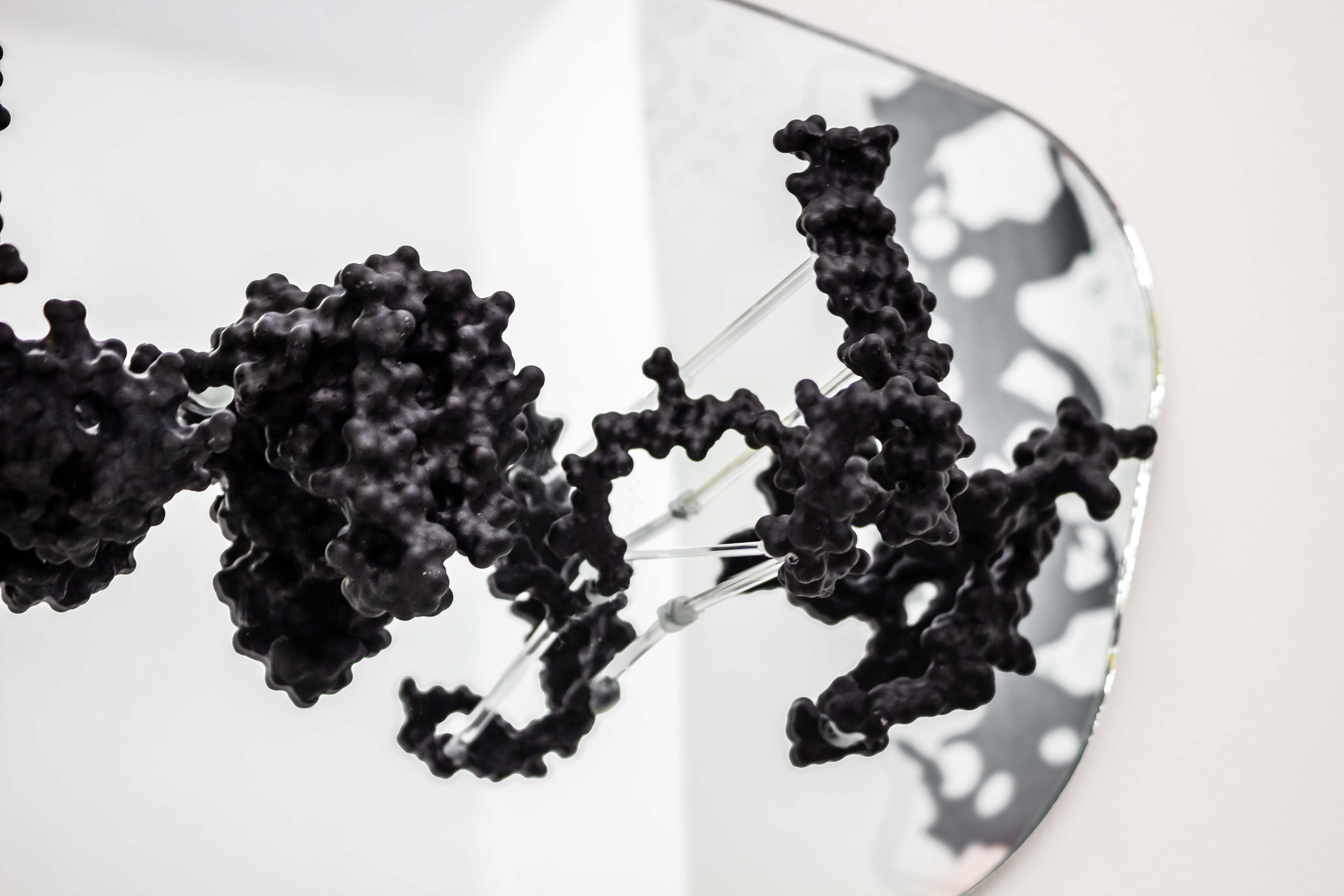
Three floor-length strips of sheer chiffon printed with protein letterforms hang in the space, present to touch as much as sight. They move with breath and people walking by, linking the project back to the physical body. Finally, four 3D-printed resin protein models spelling B-O-D-Y are mounted to a mirror so that viewers see themselves reflected behind the molecules.
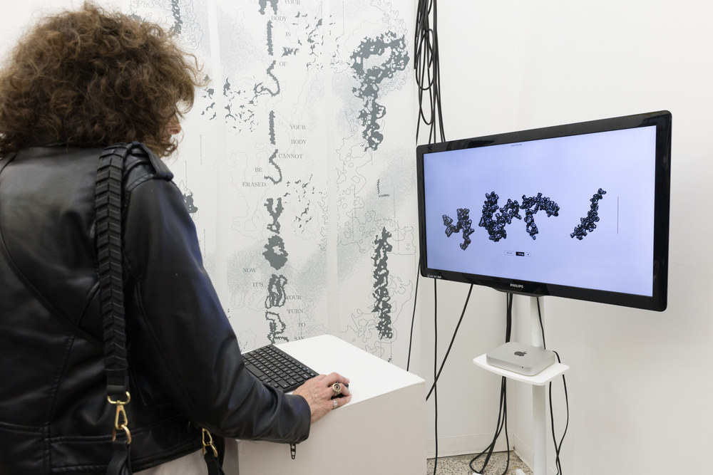
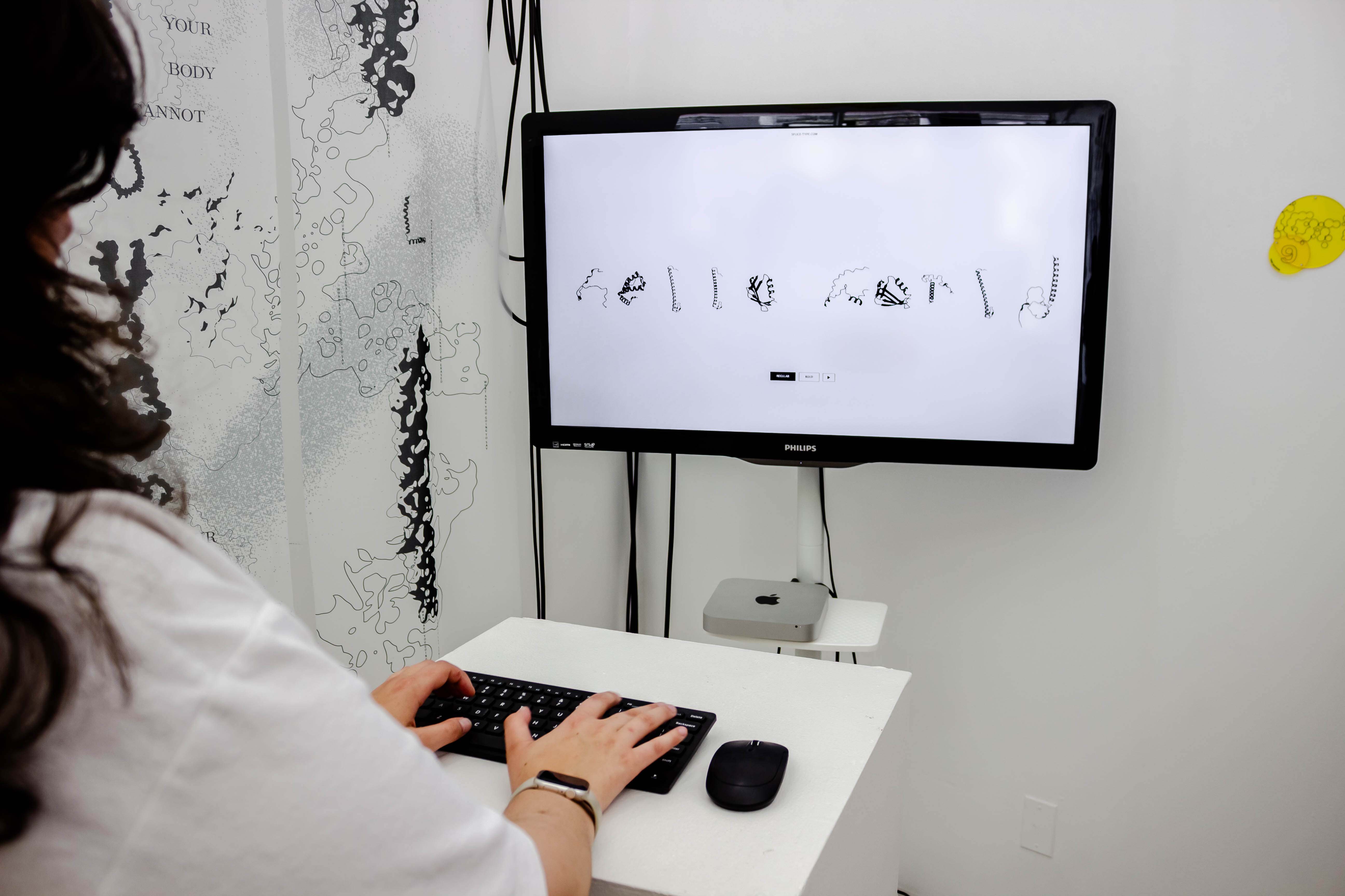
The full Splice typeface is available interactively at splice-type.com. The supporting interface is set in Computer Modern, designed by Donald Knuth using his Metafont system — a typeface built from mathematical parameters rather than drawn forms. This echoes Splice's own methodology of finding form through structure.
How Sonification Works
Every protein is a chain of amino acids — the building blocks that give it its shape and function. There are 20 standard amino acids, each represented by a single letter.
In Splice, each amino acid is assigned a unique frequency, ascending from Glycine (G) at 130.81 Hz — a low C — up to Arginine (R) at 440 Hz, concert A. The 20 amino acids map across roughly two octaves.
When a phrase is typed, each protein sequence plays from left to right — one amino acid per note, 110 milliseconds apart. Each note is two slightly detuned sine waves layered together, filtered through a low-pass. Every fourth note adds a sub-tone one octave below. The result is a unique ambient chord for every word, drawn directly from the molecular sequence of the letters that spell it.
Glossary
What's Next for Splice
Splice is not finished. The typeface is complete, but the question it asks — what happens when scientific data stops being institutional and starts being personal — is one that design is only beginning to answer. The proteins in Splice have been in your body your entire life. They will continue to be, regardless of what happens to the databases that describe them or the funding that supports the research.
What Splice proposes is that designers have a role in empowering people to learn more about themselves and the world around them, not by explaining science, but by finding new angles from which to look at it. This project is one way of looking. There are many other projects to come from this methodology.
AlphaFold's breakthrough came when researchers scrambled the input, letting the algorithm detect patterns that linear thinking missed. Discovery — scientific or visual — often comes from imagining differently. Each letter in this typeface only becomes legible from a particular point of view. The alphabet was always inside you. These are just the coordinates.
Download the Splice TypefaceBibliography
Amit, Kessel, and Nir Ben-Tal. Introduction to Proteins: Structure, Function, and Motion. Boca Raton: CRC Press, 2018.
DeepMind / EMBL-EBI. "Titin (A0A0C4DG59)." AlphaFold Protein Structure Database. alphafold.ebi.ac.uk
Fleming, J., et al. "AlphaFold Protein Structure Database and 3D-Beacons: New Data and Capabilities." Journal of Molecular Biology 435, no. 5 (2025).
Google DeepMind. "Putting the Power of AlphaFold into the World's Hands." July 28, 2022. deepmind.google
Jumper, John, et al. "Highly Accurate Protein Structure Prediction with AlphaFold." Nature 596, no. 7873 (August 2021): 583–89.
Merriam-Webster. "Pareidolia." Accessed May 13, 2026. merriam-webster.com
Merleau-Ponty, Maurice. Phenomenology of Perception. Translated by Donald Landes. London: Routledge, 2012.
Shipman, Seth L., Jeff Nivala, Jeffrey D. Macklis, and George M. Church. "CRISPR–Cas Encoding of a Digital Movie into the Genomes of a Population of Living Bacteria." Nature 547, no. 7663 (July 2017): 345–49.
Union of Concerned Scientists. "Extreme Rise in Documented Attacks on Science." Data current as of June 30, 2025. ucsusa.org
Veritasium. "The Most Useful Thing AI Has Done." YouTube, February 10, 2025. youtube.com
Whitford, David. Proteins: Structure and Function. Hoboken, NJ: John Wiley & Sons, 2013.
Copyright + Credit
Copyright © 2026 Tori Watson. All rights reserved.
© DeepMind Technologies Ltd and the European Bioinformatics Institute (EMBL-EBI). Licensed under CC-BY-4.0.
This project incorporates AlphaFold protein structure predictions developed by DeepMind. Protein structural data is used in accordance with CC-BY-4.0 attribution requirements. This site presents artistic reinterpretations of AlphaFold outputs and should not be understood as providing validated scientific data.
The supporting typeface is Computer Modern, designed via Donald Knuth's Metafont — built from mathematical parameters rather than drawn by hand, which echoes Splice's methodology.